SolidNature Sabine Marcelis

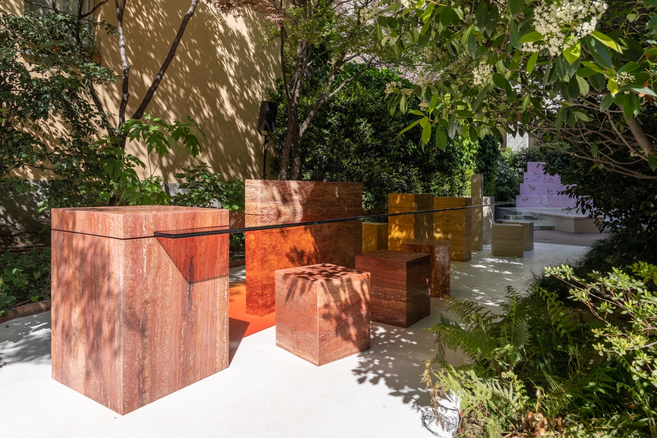
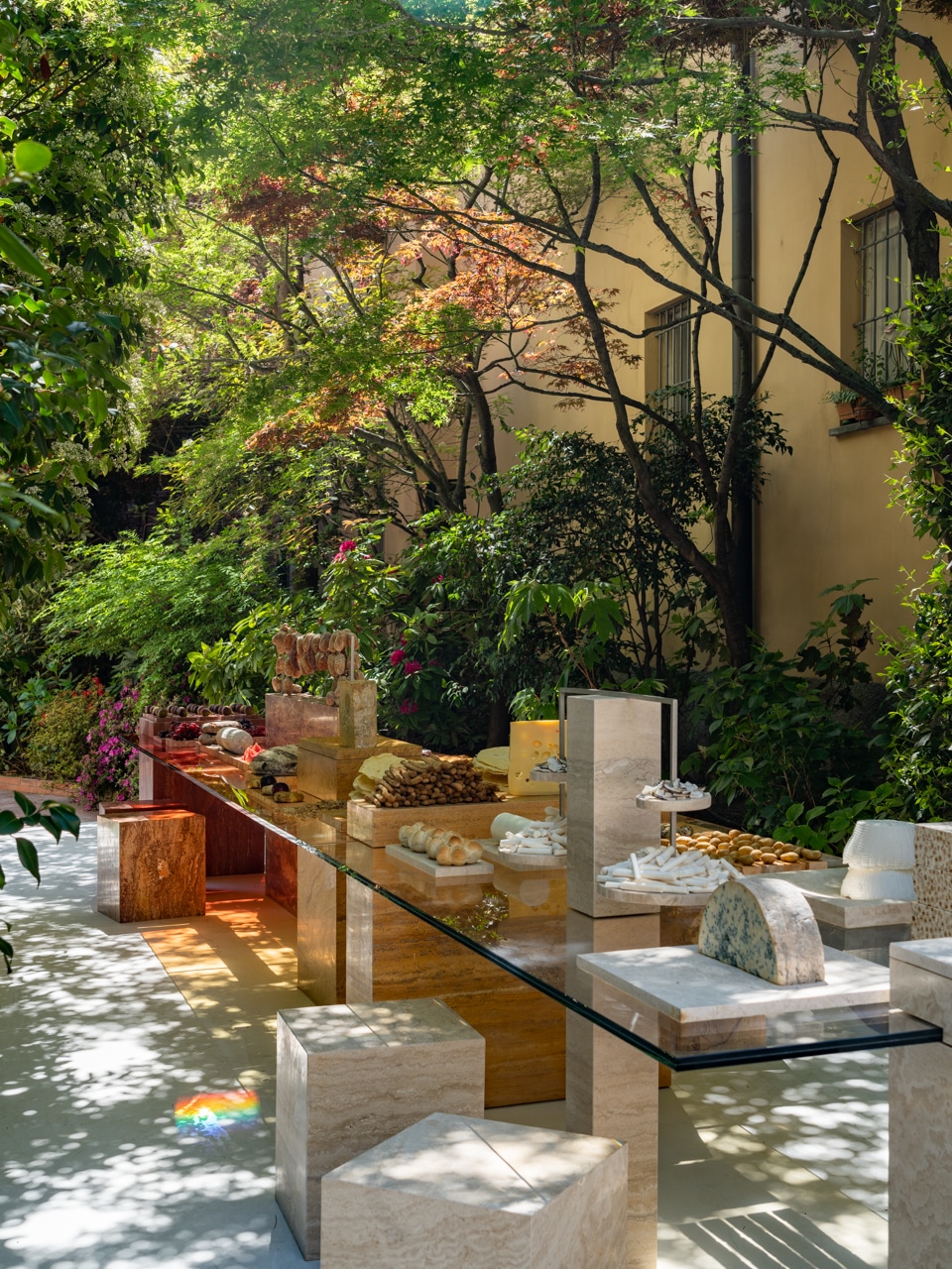
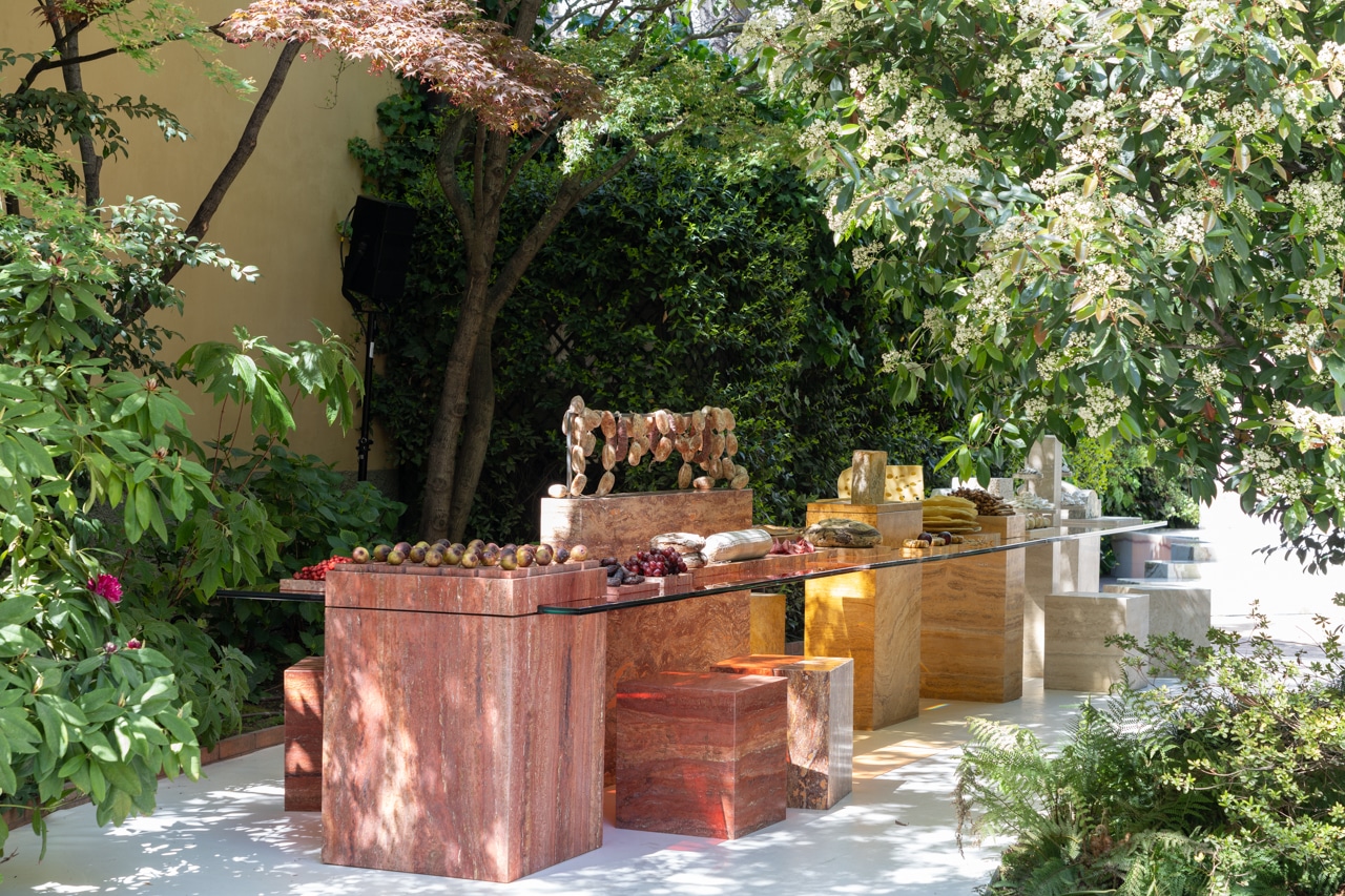
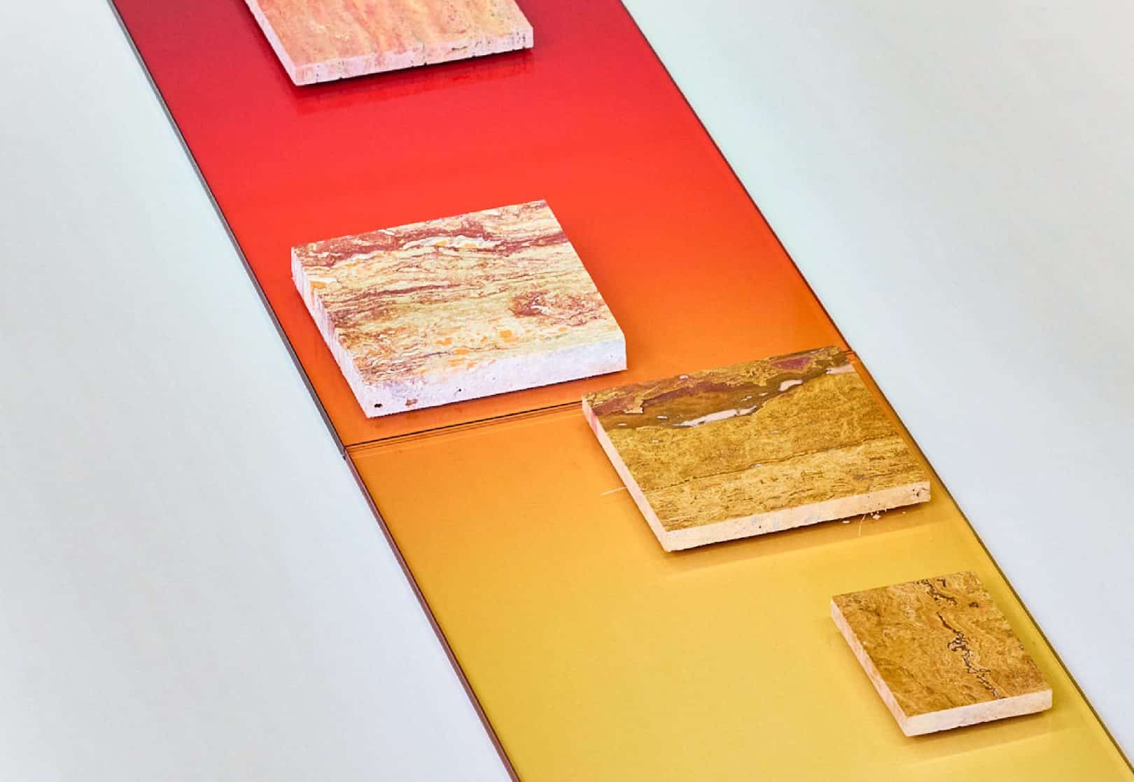
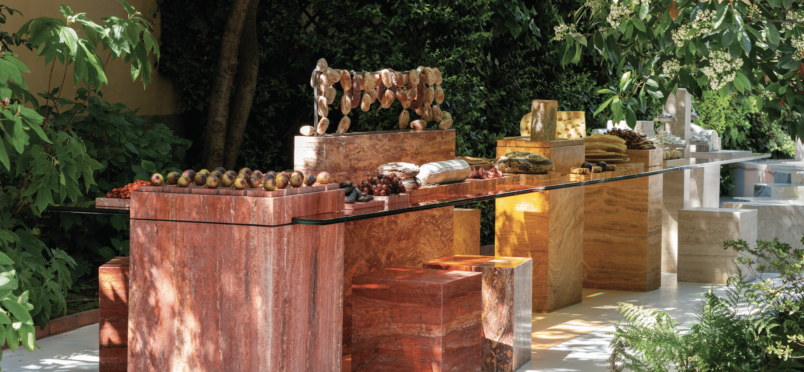
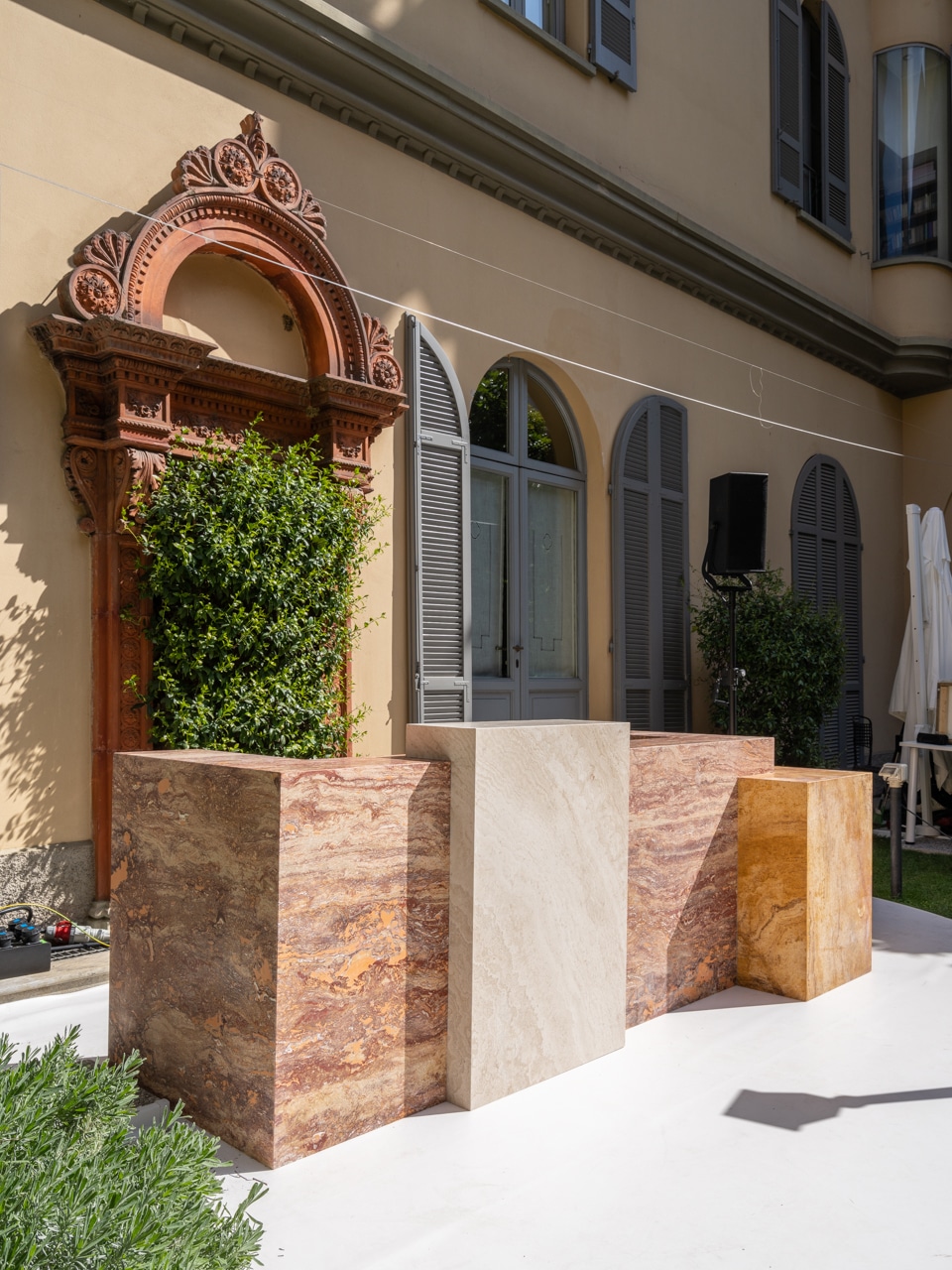
For Milan Design Week 2023, lauded Dutch designer and long-time collaborator Sabine Marcelis created a dining table and accompanying bar. The theme ‘Beyond The Surface’ inspired her to design a 7m long table, with seating and separate bar, composed of 6 different types of travertine connected by colour treated glass.

Read More
“Traditionally, the surface gives a table its function. I wanted to focus on the feet below and presentation volumes above the surface instead. With the surface being merely a transparant point of connection.”
— Sabine Marcelis

About Sabine Marcelis

Sabine Marcelis is a Dutch designer who runs her practice from the harbour of Rotterdam. After graduating from the Design Academy of Eindhoven in 2011, Marcelis began working as an independent designer within the fields of product, installation and spatial design with a strong focus on materiality.
THE MAKING OF

Q&A with Sabine Marcelis


What was the brief for this project?
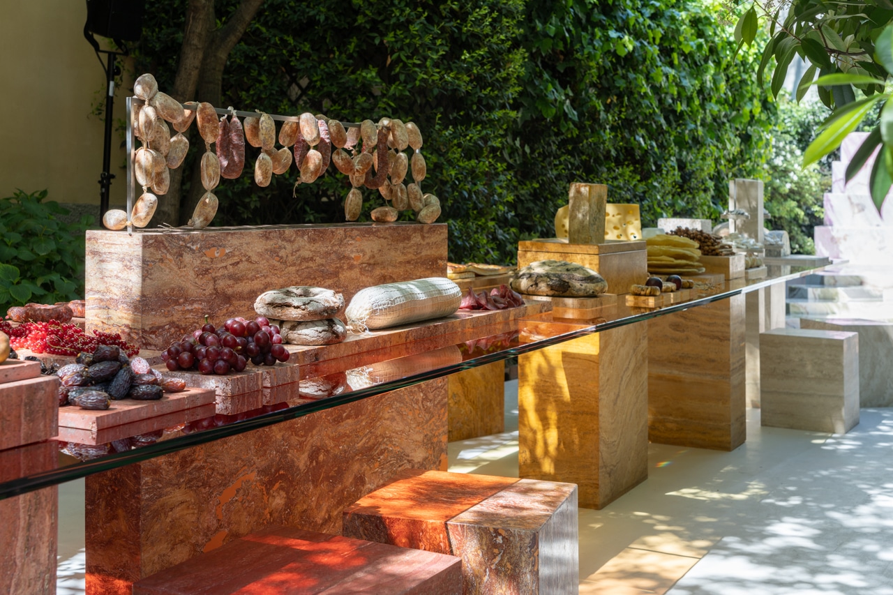
I was asked to design a table and bar for this years presentation of SolidNature at Salone. Last year was so much fun to work on and present the bathroom – we needed to step up the game this year. With the theme ‘Beyond the Surface’ I really wanted to zoom in on exactly that. The surface of the table is traditionally focussed on and what gives its function. I wanted to focus on the feet below and presentation volumes above the surface instead with the surface being merely a transparant point of connection. The feet below and volumes above are made from natural stone and the surface from my signature colour treated glass. I invited Laila Gohar to work with me on activation what happened above the surface of the table.


What was the inspiration for your pieces?
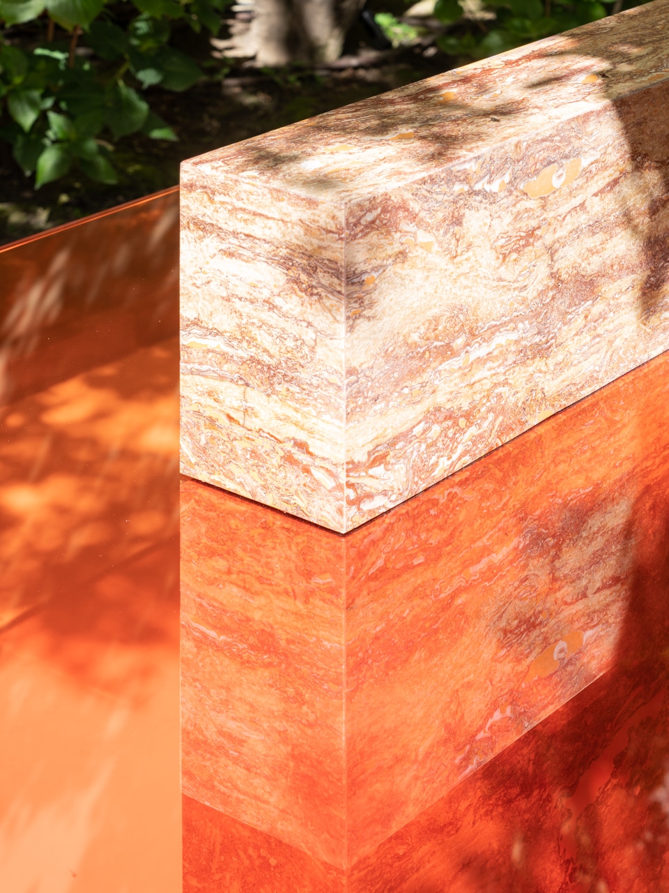
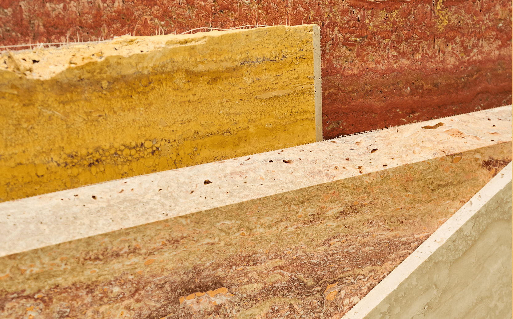
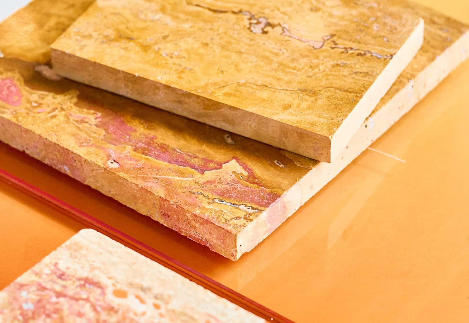
I love to work with natural stone in combination with resin and glass (the two materials I am most known for using). Until now this has mainly been from the onyx family. I wanted to work with travertine this time to elevate the stone and showcase its wide range of textures, lined and colours.


What are the most important features of your designs?
The size and interaction between the materials and their colour, but most importantly the interaction with how food can be presented on the table. Everything is connected and everything relates to each other.


What materials did you use?
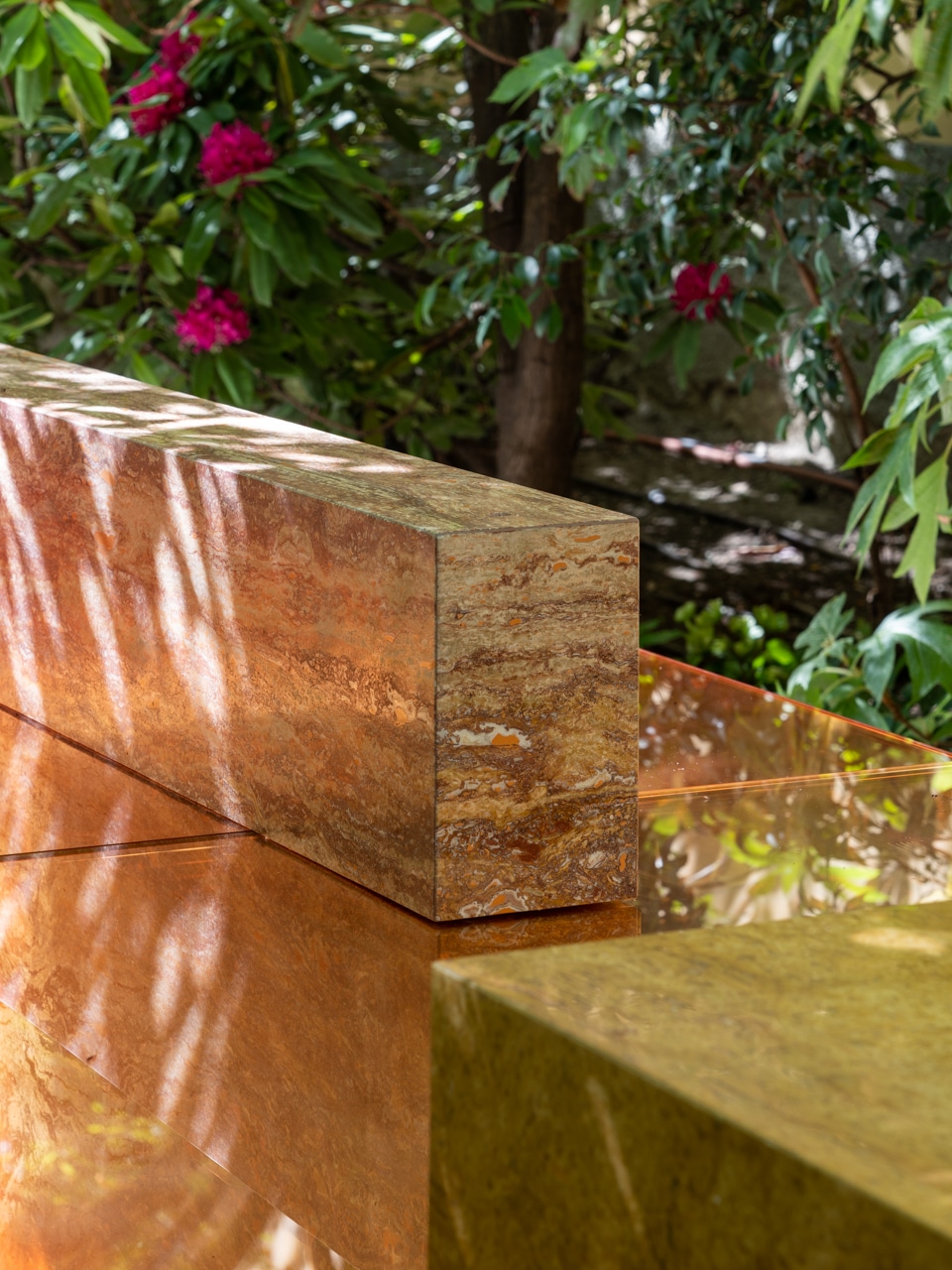
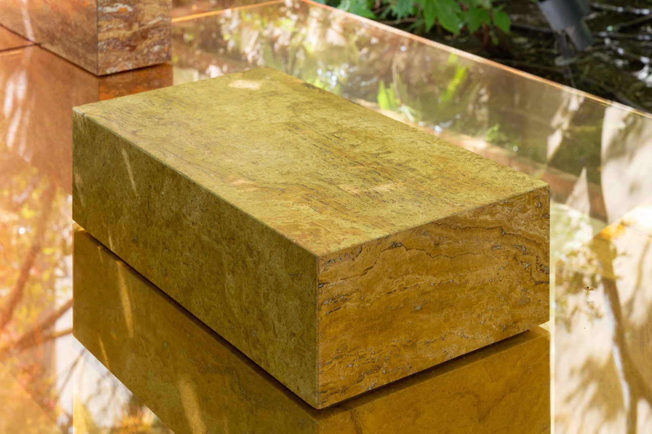
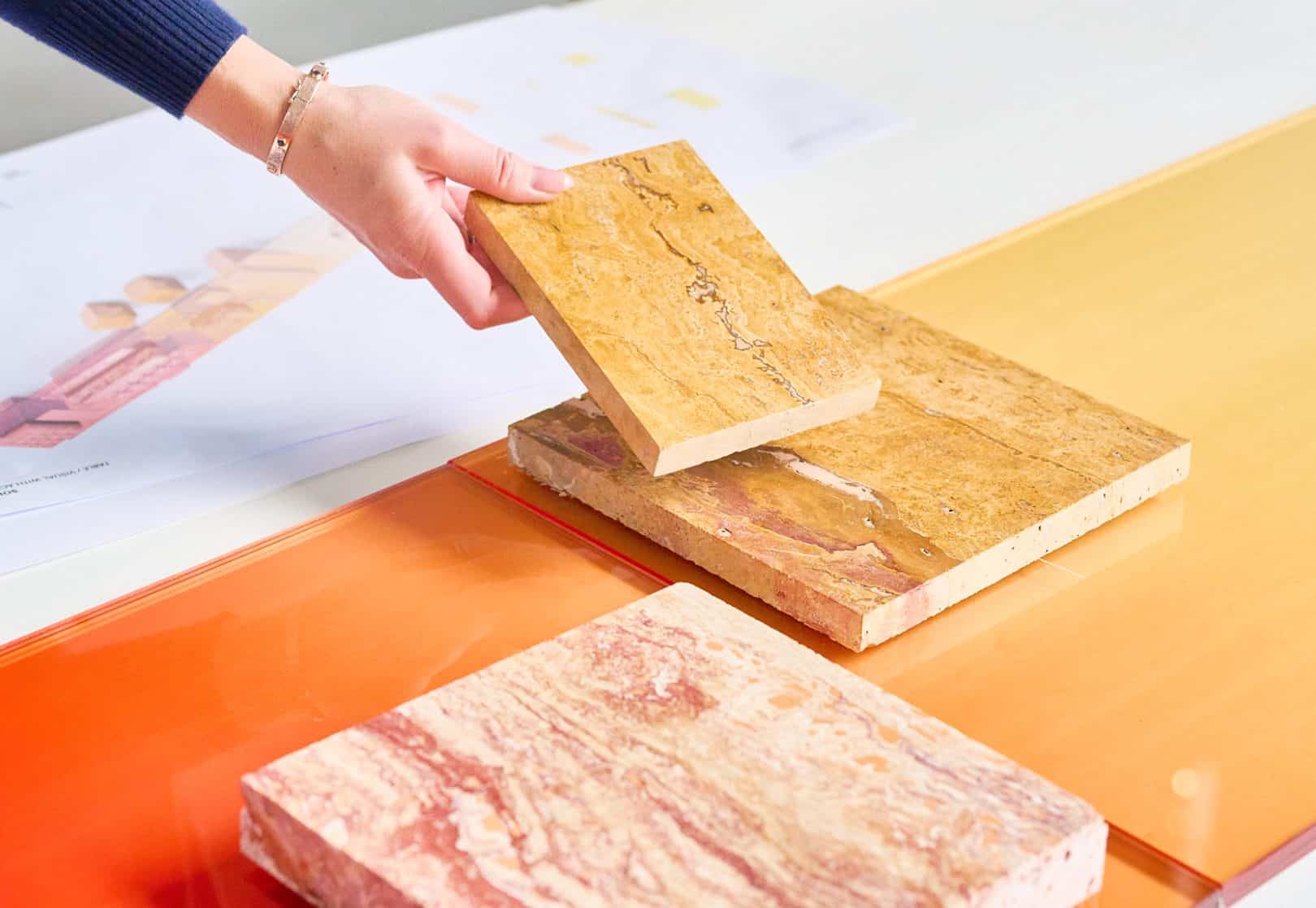
All different types of Travertine – it was important for me to show the full range of colours within this one stone type and to have that inform the rest of the colour pallet. Inspired by nature.


Why did you choose these materials?
After having worked with onyx, I wanted to work with a rougher stone that didn’t have any translucency to it – one which created a higher contrast to the glass table top surface yet provided an interesting yet warm colour pallet.


What was your design process?
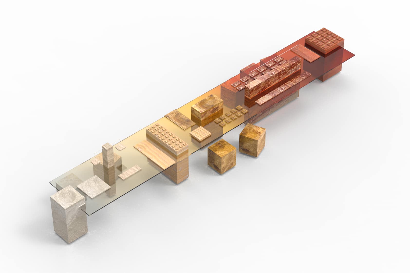
The first step was to create volumes that would support a table top and simultaneously provide enough surface to present food in different ways. We created both computer prototypes and physical prototypes to get the proportions and colours just right.


What is your favourite thing about working with natural stone?
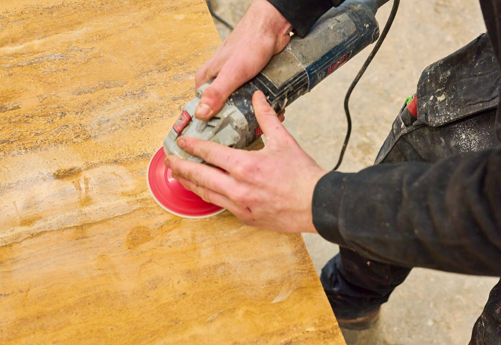
The fact that the stone is always different and unique – its a true collaboration with nature. I really enjoyed having a back and forth with Laila in this process also to further define how these volumes could house and hold food in a truly integrated manner. The table, as an object, always has two states of being – when it’s in use and food is presented on top, and when it is empty. It’s similar to lighting where you have an on and off state. I love to find the balance there -to design objects that are sculptural yet functional and function optimally yet unexpectedly in both states.


What colour palette is dominant within the project and why?
As always, I let materiality and colour inform the outcome of a project. It was no different with this project. I love to have the natural colours lead and to tint the glass to match those colours. The colours of natural stone are so surprising and almost look manmade. This tension of what is natural and manmade is a space to be creative. I particularly enjoy working with warm colours these days so the tints of the table and bar are a warm colour gradient ranging from a deep red to orange, to yellow, to beige, to a cooler grey-white.


www.sabinemarcelis.com
@sabine_marcelis